Guide
Aesthetic Desk Setup Ideas: Which Theme Fits Yours?
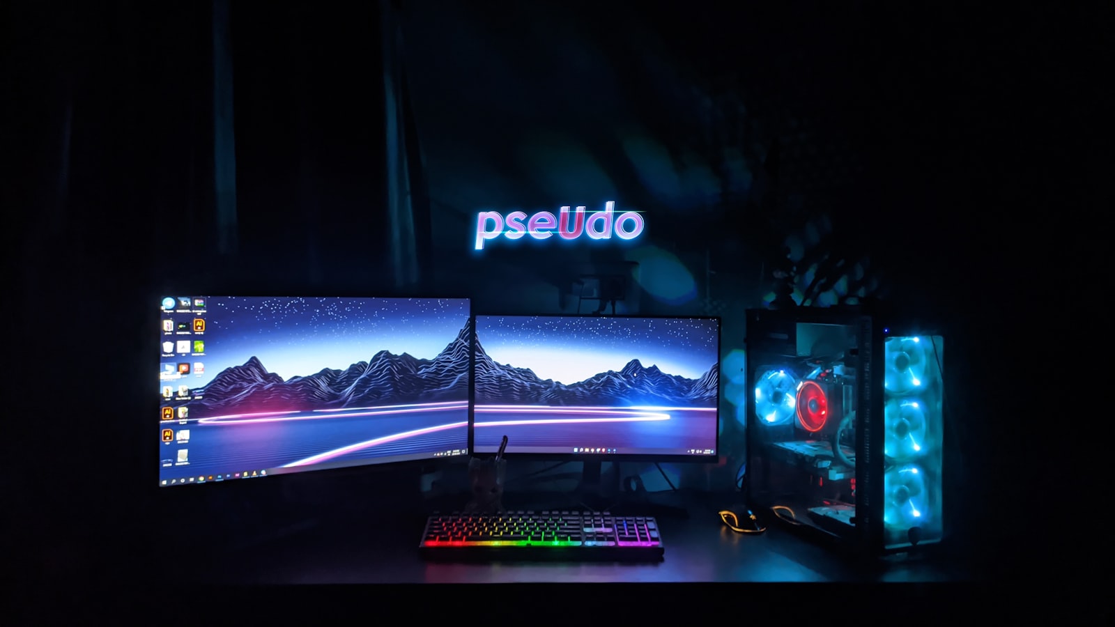
Picking a theme before you buy anything saves you from ending up with a pile of mismatched gear that never quite looks intentional. Here’s what each of our themes actually looks and feels like, so you can pick one before you start shopping instead of after.
Ocean
Blues and sandy neutrals, calm rather than flashy. Works well if your desk sits in a bright room and you want something that reads as relaxed rather than high-energy. See Ocean picks.
Space
Deep purples and near-black tones with small neon accents, usually blue or purple. Fits a darker room better than a bright one since the contrast is part of the appeal. See Space picks.
Cyberpunk
High-contrast neon pink and blue against black. The most visually loud of the seven, and the one that leans hardest into RGB lighting rather than away from it. See Cyberpunk picks.
Pastel
Soft pinks, creams, and light lavender. Reads as friendly and casual rather than “gaming setup,” which is exactly the point for a lot of people who pick it. See Pastel picks.
Forest
Greens paired with wood tones and natural materials. The easiest theme to blend into a room that already has plants or wood furniture in it. See Forest picks.
Minimal White
White and light gray, almost no color at all. The lowest-maintenance theme to keep looking clean, since there’s nothing bright enough to look dated in a year. See Minimal White picks.
Sunset
Warm gradients from orange into pink. Works best as an accent-lighting theme rather than an everything-colored theme, since orange peripherals are harder to find than orange lighting. See Sunset picks.
How to actually decide
Match the theme to your room’s existing lighting and furniture before matching it to what looks best in photos. A cyberpunk setup in a small, bright room fights the room instead of working with it, while the same setup in a dim room does exactly what it’s supposed to do. Once the theme is settled, a desk pad is the cheapest way to commit to it. Something like the YSAGi desk pad comes in enough colors to carry any of the seven above without touching anything else on the desk.